Kaster Eye Clinic
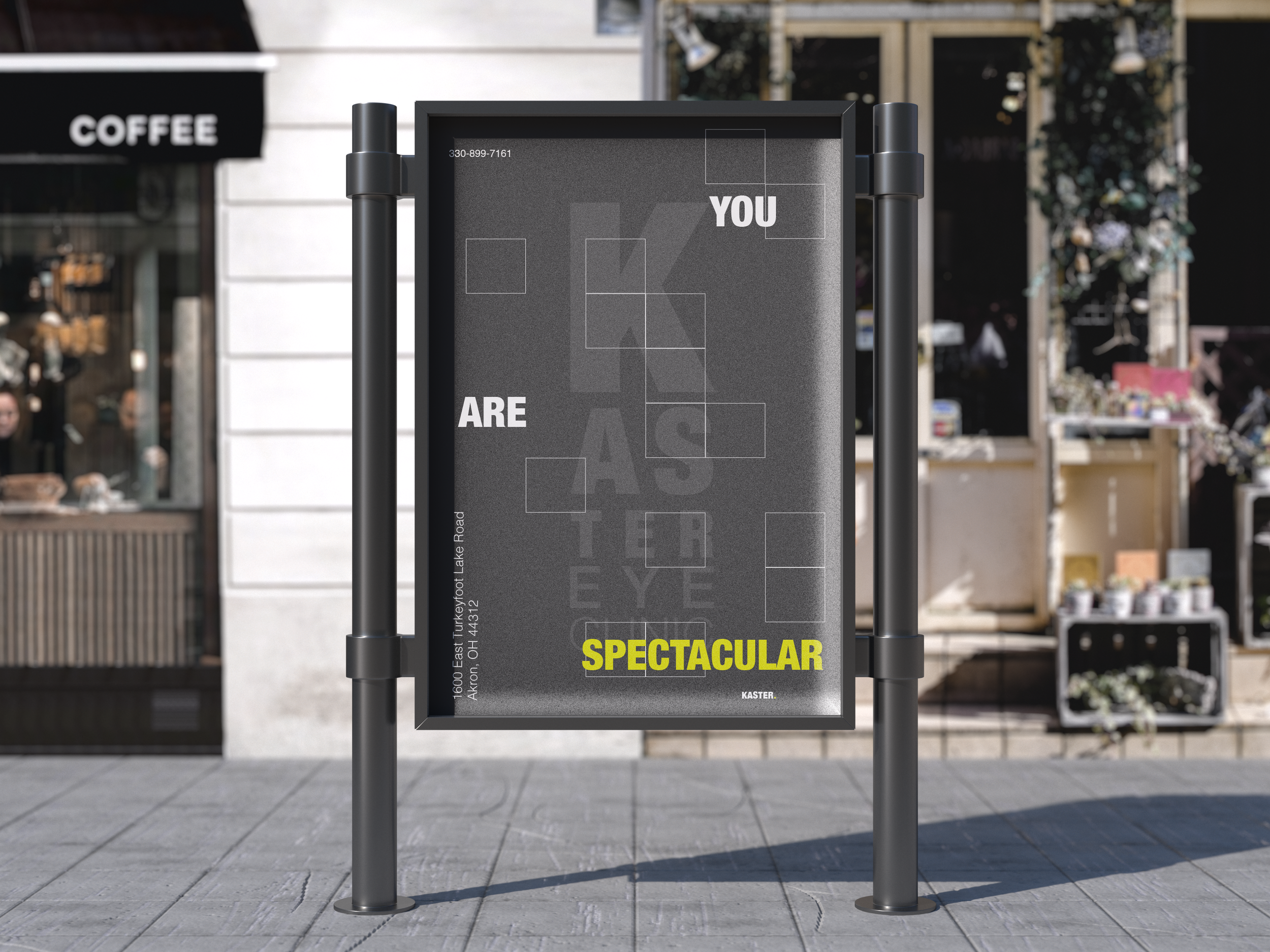
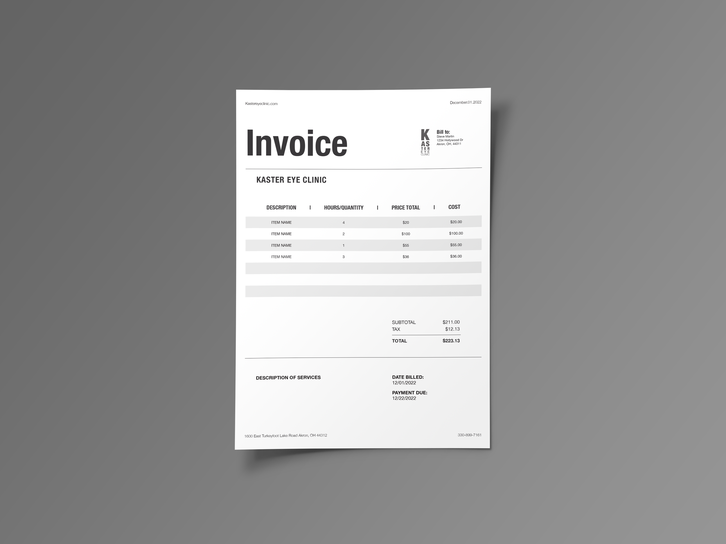
Kaster Eye Clinic is a local eye doctor that I chose to rebrand. When rebranding this company I thought about how most eye doctors use an eye as their logo in some way. Kaster Eye Clinic used a blue eye as its logo. For their new rebranding, a strong contrast in colors was used to bring attention to remind people that they need to remember to go to the eye doctor. There is a primary logo of the name of the eye doctor that is displayed in a form of an eye chart as well as a secondary logo of a pair of bold glasses.


